Luc Hoffman transforms to Unearthadox
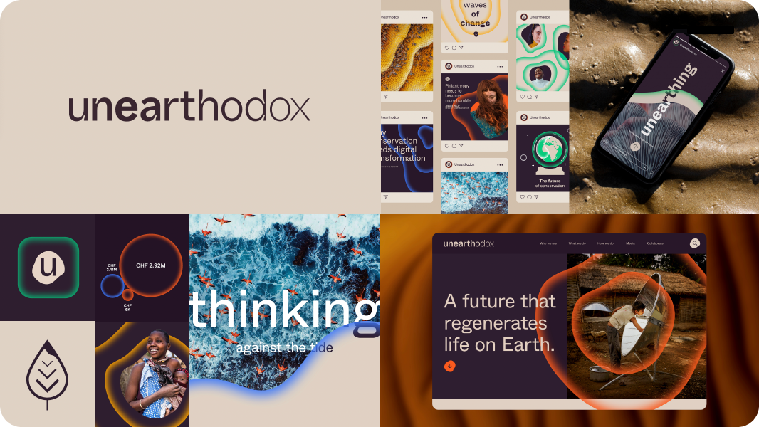
THE BRIEF
The Luc Hoffmann Institute was a key funder of global conservation efforts working with WWF to help marshal world-class thinking
in science, policy and practice to improve the impact of conservation.
In 2023, the Luc Hoffmann Institute became a separate entity from WWF International and became a new foundation: Unearthodox.
With this new beginning, the institute needed to maintain its original DNA while entirely reinvigorating how it engages everyone from academics to donors.
This new rebrand would include a new name, logo and a new website - that served as the focal point for the launch.

RESEARCH
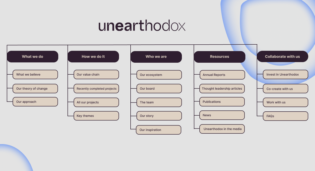
The sitemap
Inspired by conversations with stakeholders, partners and innovators the rebrand decided to challenge conventions and create a unique, unconventional spirit. this challenge was also aimed at enhancing website navigation and user experience.
Taking the research from stakeholder interviews and competitors in this sector I delved into understanding the intricacies of categories, and content hierarchy within the site to identify key areas of improvement in site organization and navigation.
This sitemap was the first step in beginning to meld design with the user experience that not only streamlined website navigation but also provided valuable insights for future website optimization efforts and the construction of web content needed for the team at Luc Hoffman to begin to develop.
UX writing
With a rebellious rebrand on the way, a new tone of voice was developed to reflect the new positioning. With Luc Hoffman's process of co-creation that brings people from diverse perspectives together, I needed a pathway to create a copy on the website in an intuitive, engaging, and user-friendly experience.
Luc Hoffman's process is all about co-creation and bringing together people from diverse perspectives to imagine different possible futures. This tone of voice needed to be represented in all aspects of the new Unearthadox website.
This site map needed phrases that were simple and easily translated, as it minimizes the need for extensive translation and adaptation of specialised terms. By working with Luc Hoffman's stakeholders and applying UX writing to the page titles, I was able to use clear and universally understandable language, which can cater to diverse audiences more effectively.
Design considerations
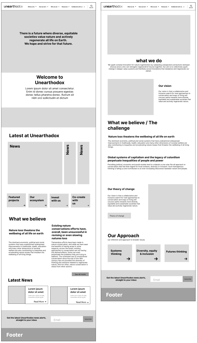
Wireframes
The use of wireframes was instrumental in the rebranding process of a website for Unearthadox. The wireframes served as the first tangible step in the way Unearthadox wanted to speak to its audience. They provided a structured framework for planning,
organizing, and visualizing the new design. By leveraging the wireframes effectively, we can ensure that the rebranded website delivers an engaging user experience that aligns with the brand identity and strategic objectives.
Since wireframes were the first step to applying the new brand identity, I worked closely with the Luc Hoffman stakeholders to develop content areas, restructure the hierarchy and ensure that the visual communication provided a common reference point
for discussing design decisions, gathering feedback, and ensuring alignment with the overall brand strategy.
These wireframes also served as a structured canvas for the UI designer to translate the new brand guidelines into a digital format. We worked together to ensure that both visions were aligned and agreed upon by the Luc Hoffman board members.
The movement to match the brand
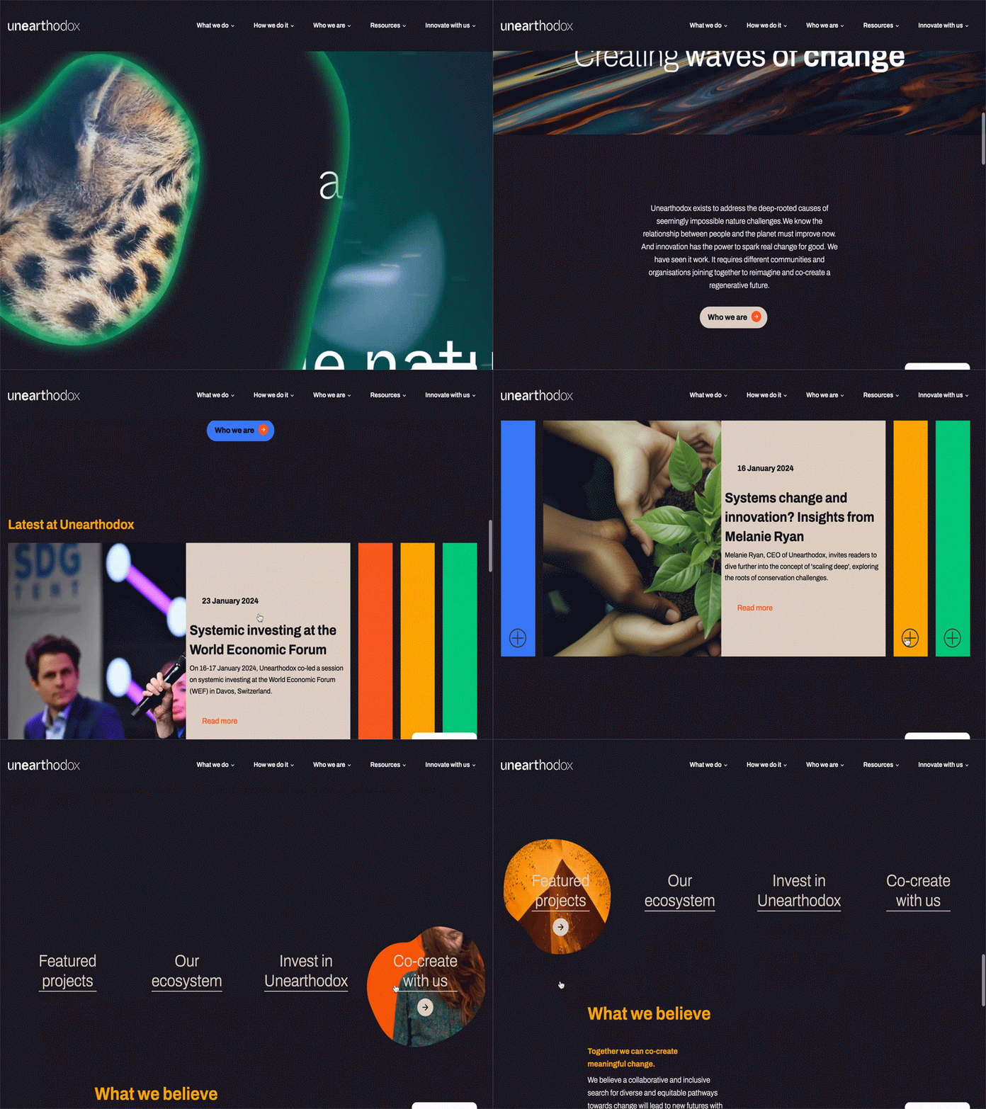
Movement can be used to tell a story or reinforce a brand identity. Animation, videos, and transitions can convey brand personality and values dynamically and engagingly, helping to create a memorable impression. Together with the brand teams and
motion designers, we translated the rebellious spirit of the brand into the movement online.
To ensure the user experience remained engaging without becoming overwhelming, we designed the movement to be fluid and responsive to the user's movements on the website to provide feedback. This movement flow is slower and mimics the "waves of change"
described in the brand guidelines. We also ensured to design of static versions to adhere to accessibility guidelines.
Design handoff & Module breakdown
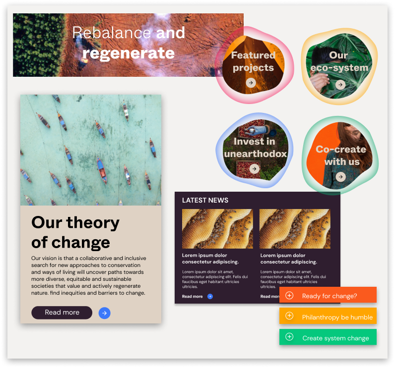
One aspect of this project was that the Luc Hoffman development team would be developing the website after the designs were approved.
This meant that their involvement throughout the UX/UI design phase was crucial as we had to ensure they felt comfortable in building the different modules we created and translating the movement to screen.
We also wanted to ensure that they were able to meet their deadlines and worked together to decide on about 15 core modules that could be reused across the different pages and use cases. These modules were extensively documented and packaged with the use of the
RY Figma file to make sure the development team got everything they needed before development. Finally, we continued weekly stand-ups with the team for any questions and concerns that may arise during the build process.
Launch
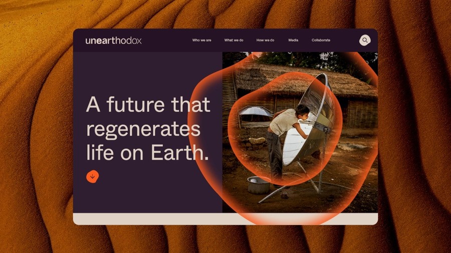
The Unearthadox website was launched in February 2023 with a small rollover contact for QA changes from the design team to update.
To see the full website in action take a look here
Any questions on further work performed for Unearthadox feel free to get in touch.
