Tesco Sustainability Refresh
As the world's largest retail corporation, Tesco knows it can make a big difference.
Tesco corporate have built sustainability into its purpose, strategy and business plans and knows they are
responsible for creating change in its industry and across the communities it provides for.
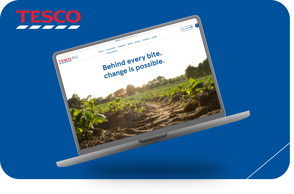
------- THE BRIEF -------
As an industry leader, Tesco needed to align its updated sustainability strategy to its corporate website and other communications channels.
Tesco has been making significant, industry-shaking sustainability efforts for decades. And it is not a siloed
effort - internally, every area of the business lives and breathes sustainability too.
However, the website does not do justice to Tesco’s sustainability efforts.
The current website architecture and layout do not showcase and amplify the incredible efforts Tesco is making. It can be too text-heavy,
and hard to grasp an overall impression of what Tesco is doing in the space. Tesco also struggled to know who their true audience is on their site.
With all these problems in mind, we believed restructuring the whole sustainability section, refreshing Tesco's sustainable story across the whole PLC website
and redefining Tesco's audience values would bring huge opportunities to convey Tesco’s sustainability story to life in a clear, compelling way.
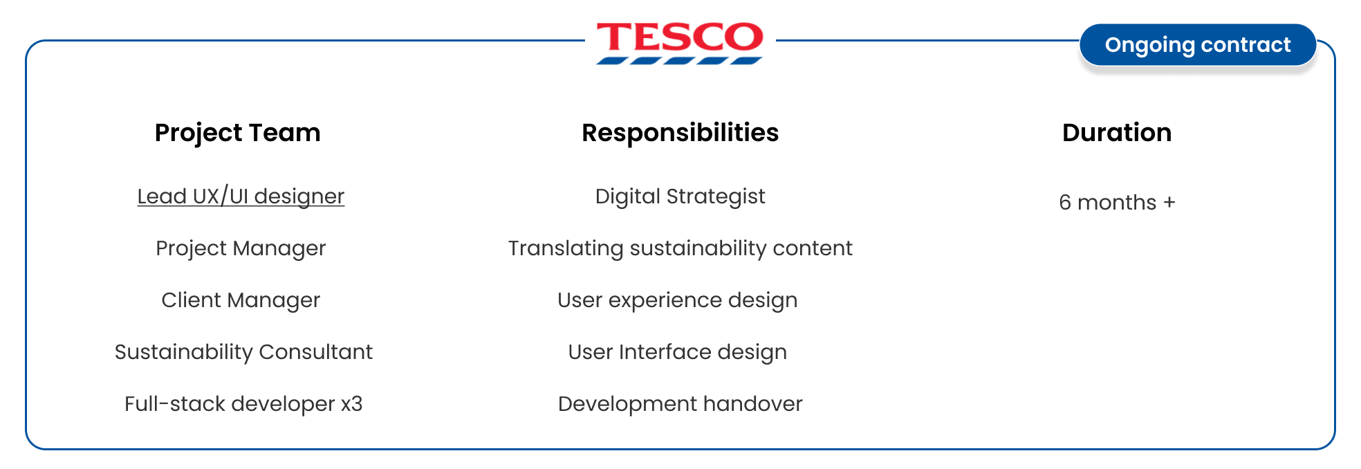
------- DISCOVERY PHASE -------
Research
1.
Audience discovery
Using tools such as Hotjar and current website analytics we discovered what current audiences were interested in. We defined these two distinct audience groups as generalist and specialist.
2.
Competitor analysis
Performed a competitor analysis on all Tescos-defined competitor's corporate websites and sustainability communications to their defined audiances.
3.
SEO & analytics research
Analysed Tescos PLC's website's current SEO strategy and last year's performance from Google Analytics to determine what the audiance was interest in and how the website performed.

------- EXPLORE -------
Closely align with a sustainability consultant to ensure the sustainability story and architecture of the site have a constant flow. We achieved this by working together on:
Stakeholder interviews (48 in total)
Alignment on sitemap
Development of content strategy
Audit of current sustainability pages on Tesco PLC

------- PRIORITISE -------
Accumulating the discoveries found in our research phase we decided to prioritise our recommendations by tackling three key areas of the UX.
These areas are:
The information architecture & re-design of the primary navigation, the storytelling for the generalist audience on the homepage and the sustainability reporting hub.
While these four key areas were priority areas for the user experience, they also helped to develop the overarching look and feel for sustainability on PLC and Align with the overarching sustainability strategies from Tesco.
------- DESIGN -------
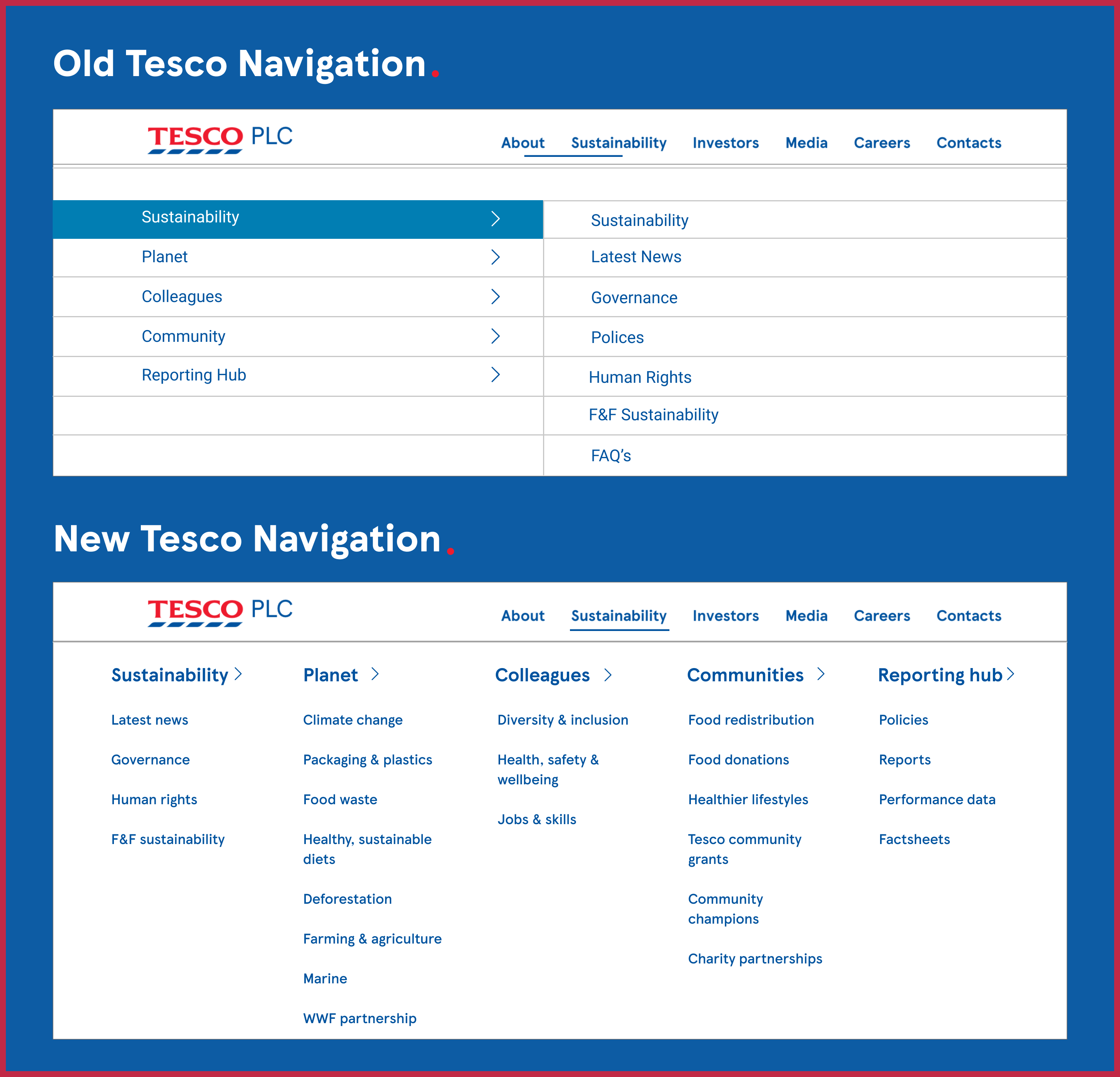
Defining the IA & Re-doing the navigation.
The information architecture and creation of a new navigation stemmed from defining both of the main users' needs. The users needed a defined architecture that aligned with the sustainability
strategy and the annual report. These users also needed to be able to see all pages on the navigation to help cut the bounce rate and user fatigue found in the previous sustainability section.
After discovering these needs the navigation and menu that sat currently on Tescos website did not fit. As such, we re-designed the look and functionality to better fit Tesco's audiences.
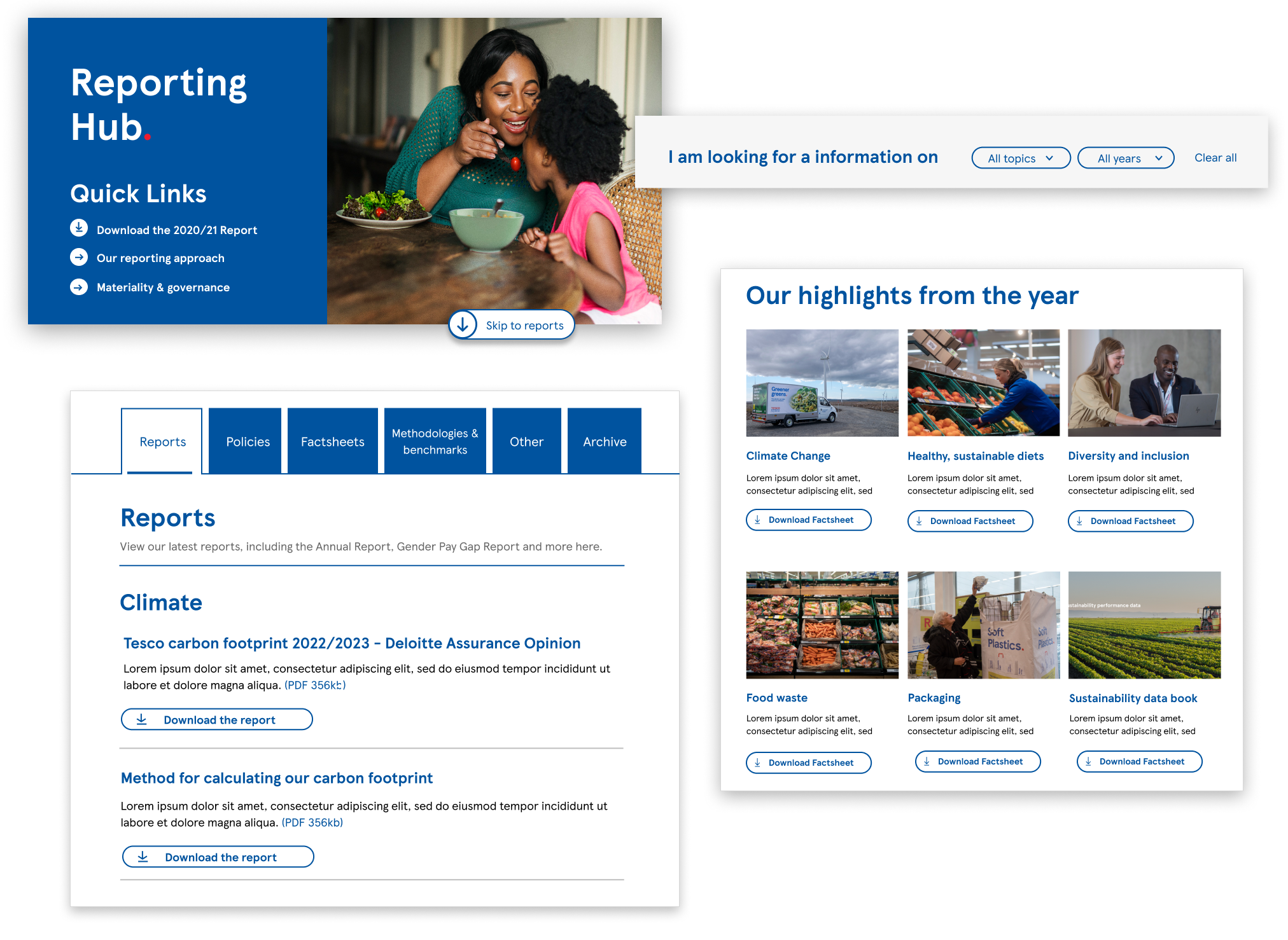
Reporting hub for a specialist audience
The Tesco sustainability reporting hub was quickly identified as an important aspect of Tesco's strategy and a key interest to the 'specialist' audience group.
The reporting hub needed to allow this user group to download the annual report, be updated on the latest sustainability goals and initiatives and hold key documents
for any future sustainability assessments.
Story-telling for a generlist audiance
From our audience research our generalist audience consisted of a younger demographic that was just learning the ins and outs of sustainability. This demographic needed an engaging, simplified story to paint the picture of the wider issues Tesco's sustainability strategy would face.
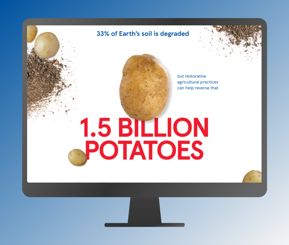
From a user experience and content perspective we chose to tell this story on the sustainability homepage using bold floating text and parallax movement that helps bring the audience into the overall experience. This page can give an overall context to the strategy and then help this audience
navigate to more in-depth information, if interested.
After discovering these needs the navigation and menu that sat currently on Tescos website did not fit. As such, we re-designed the look and functionality to better fit Tesco's audiences.
------- QUICK KPI's -------
Since the re-launch of the newly restructured sustainability section, we have reached many of our first-year KPIs. These highlights include:
- Sustainability Users are more engaged than the average Tesco PLC user viewing 40% more content within the section
- 99.91% uptime across all sections of sustainability
- 80% of users spend more time on the site since the re-launch
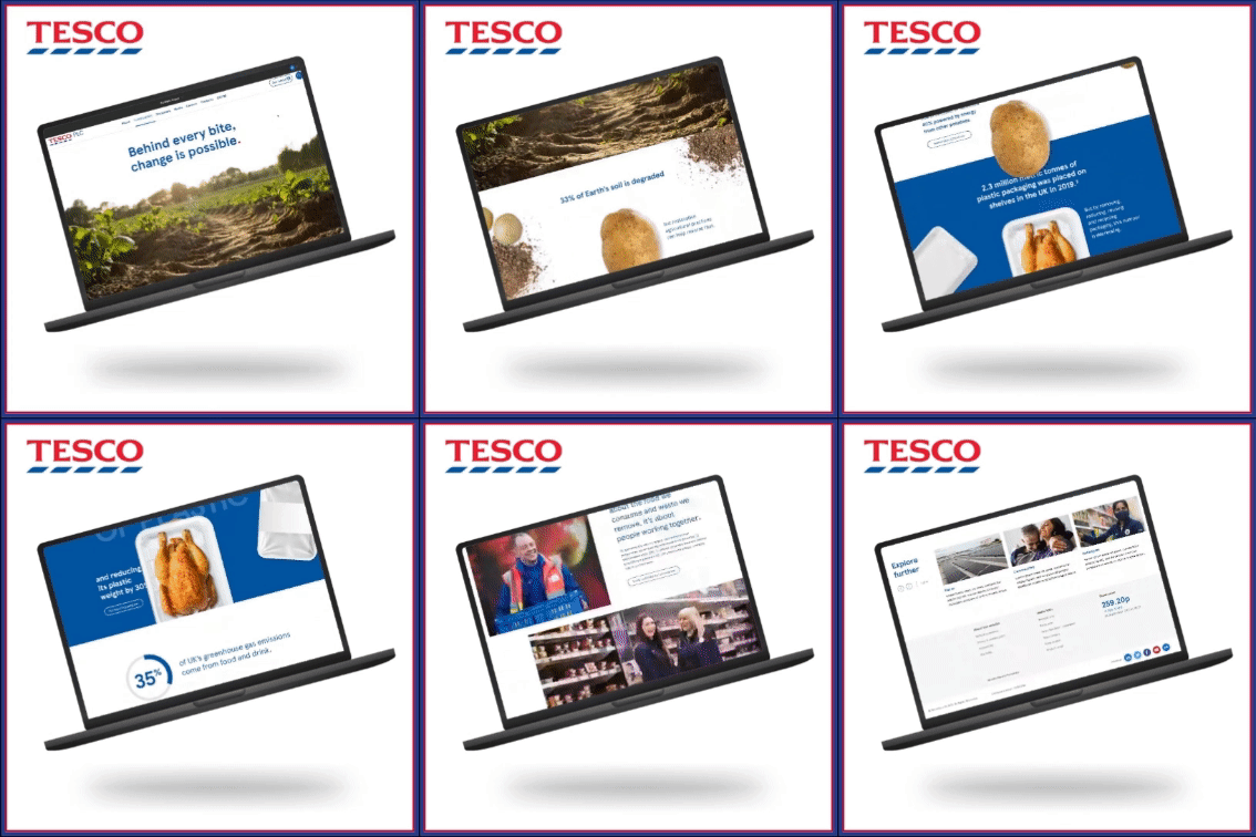 There was so much more work that went into this project than outlined above so if you would like to see more take a look at the full website linked below
*Pages of the website may look differently than outlines. Radley Yeldars team is constantly improving the Tesco PLC website as of an ongoing contact with the Tesco team. The designs above are from the beginning of the launch.

