Perfect Properties Case Study
The Challenge
The Problem:
This app is made primarily for small-scale property buyers who are looking to invest for additional income or financial
security.
Buyers will use this tool when conducting property searches and making a decision whether at home or on the go.
Unseasoned buyers need access to reliable, uncomplicated information about their potential property investments.
My goal as the UX/UI designer was to focus on a clean minimal look for the app but ensure that all important information
can be easily accessed.
Short and sweet:
How can I make this app simple for new buyers, but not so “dumbed down” for seasoned buyers?
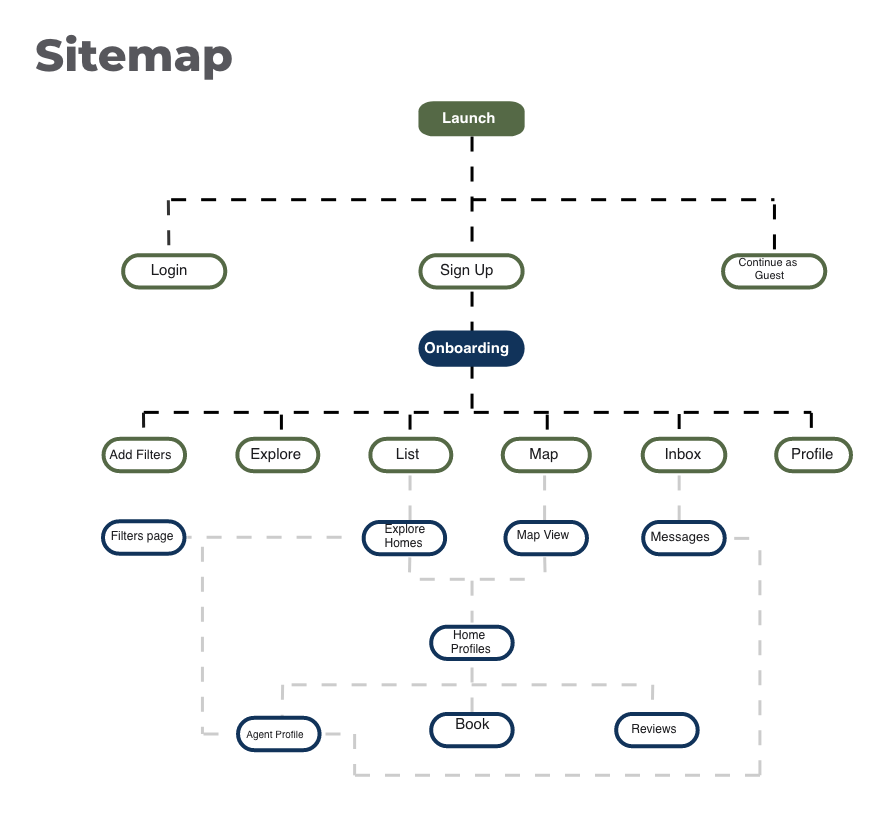
Sitemap
The first step was building an overview site man to ensure I was creating the quickest way to the VIPs of the app. Those VIPs are Map view, Home Profiles, Booking house tours & looking at agents.
Low-fedility Wireframes
The first step was building an overview site map to ensure that I was creating the quickest way to the VIPs of the app. Those VIPs are Map view, Home Profiles, Booking house tours & booking at agents.
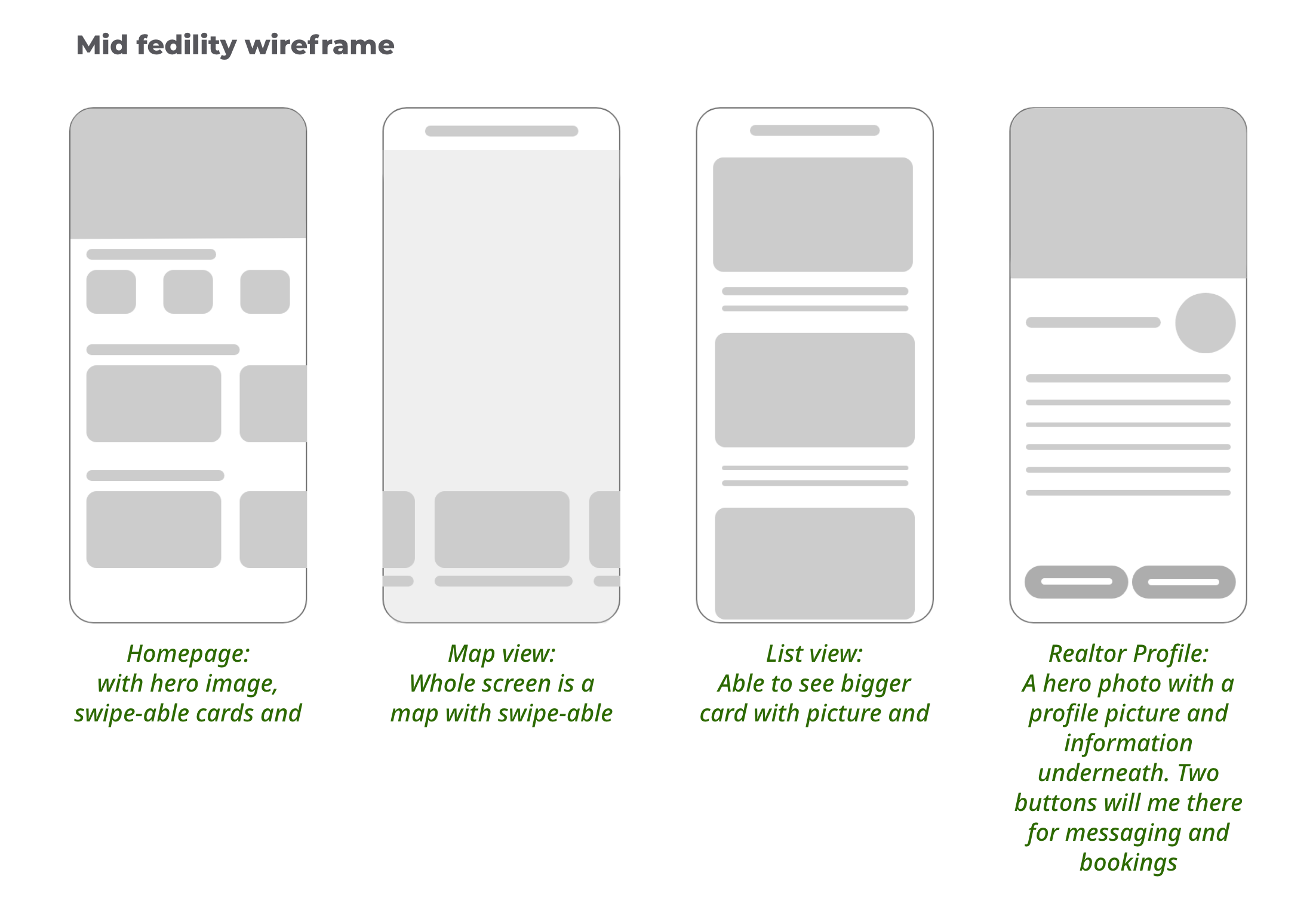
I wanted these frames to have plenty of space so the picture of the homes could be the selling point.
The Brand
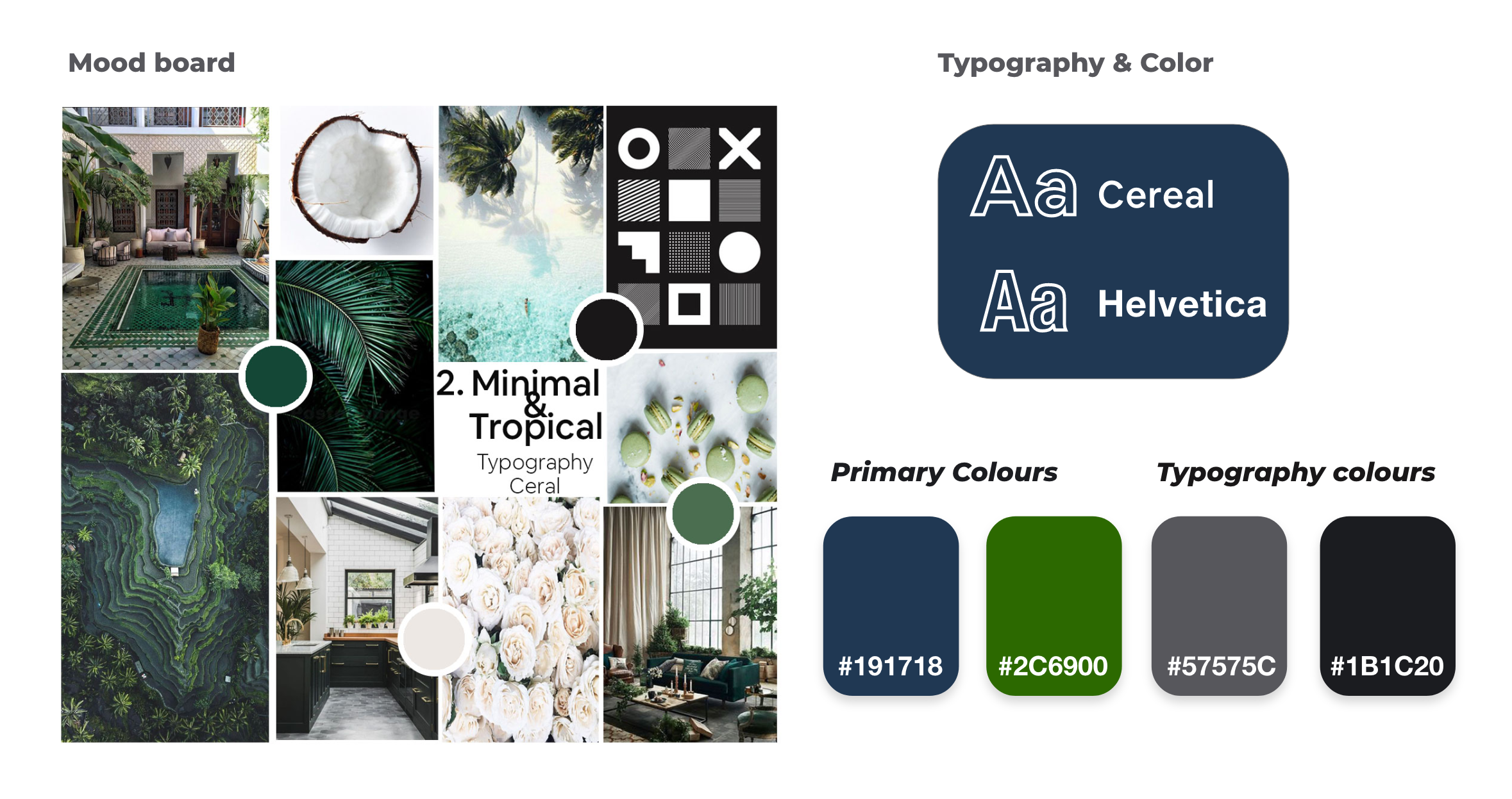
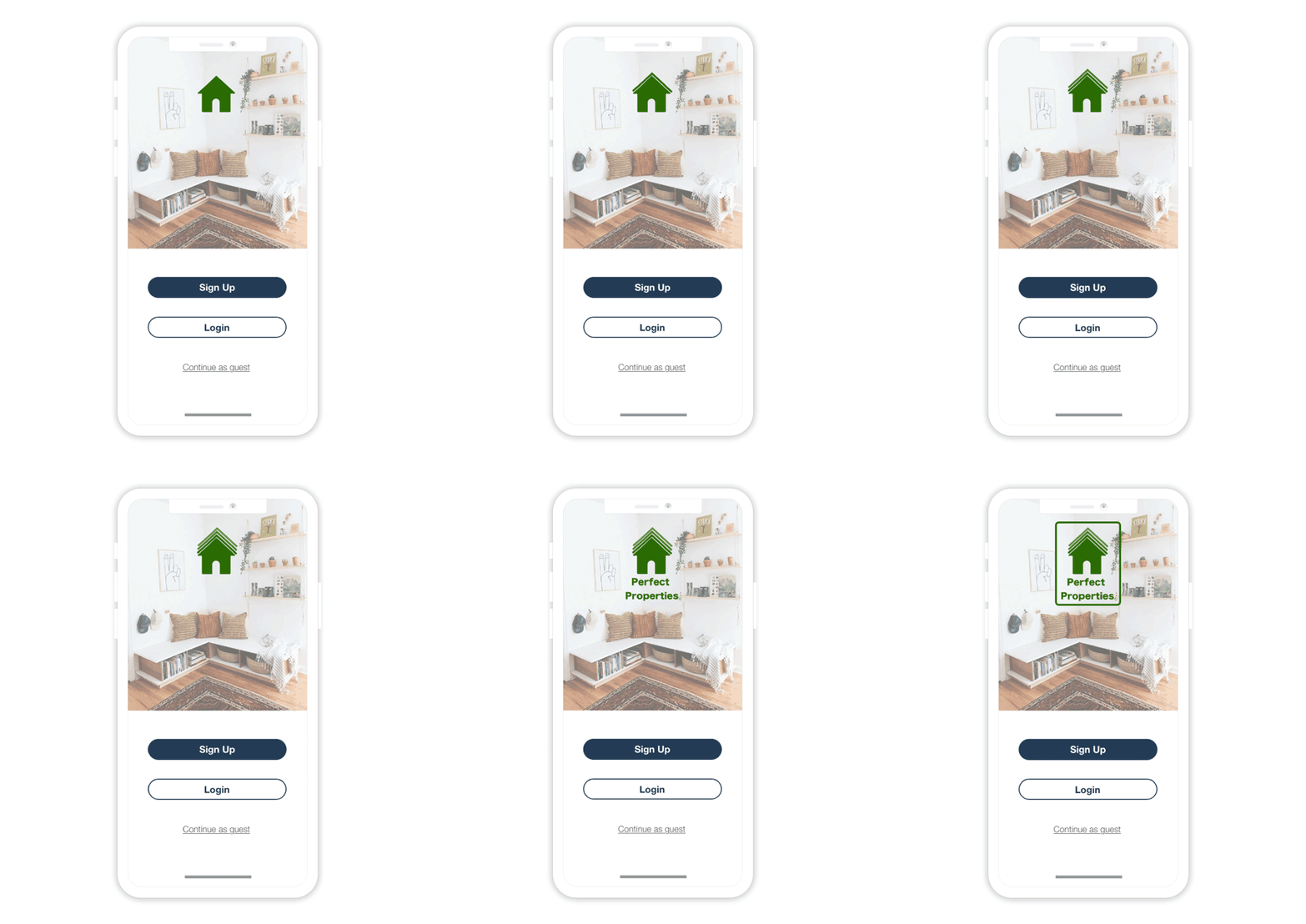
To start I created a couple of different mood boards to help define the brands feel. This mood board was selected because it was said it felt “simple, clean and the colours were calming”. From there we wanted a clean typographic to match the chosen aesthetic.
High-Fidelity UI Design
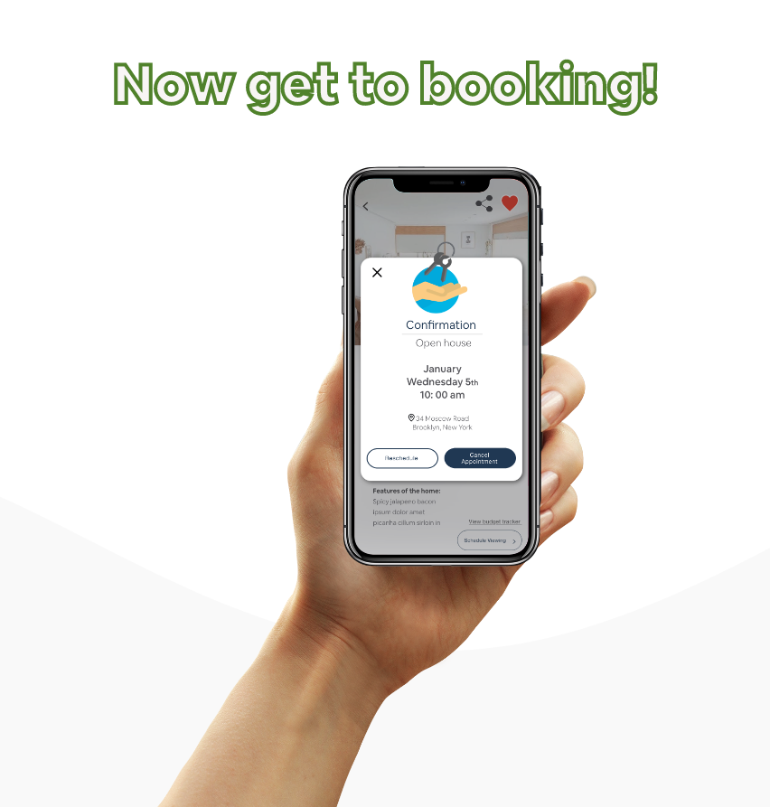
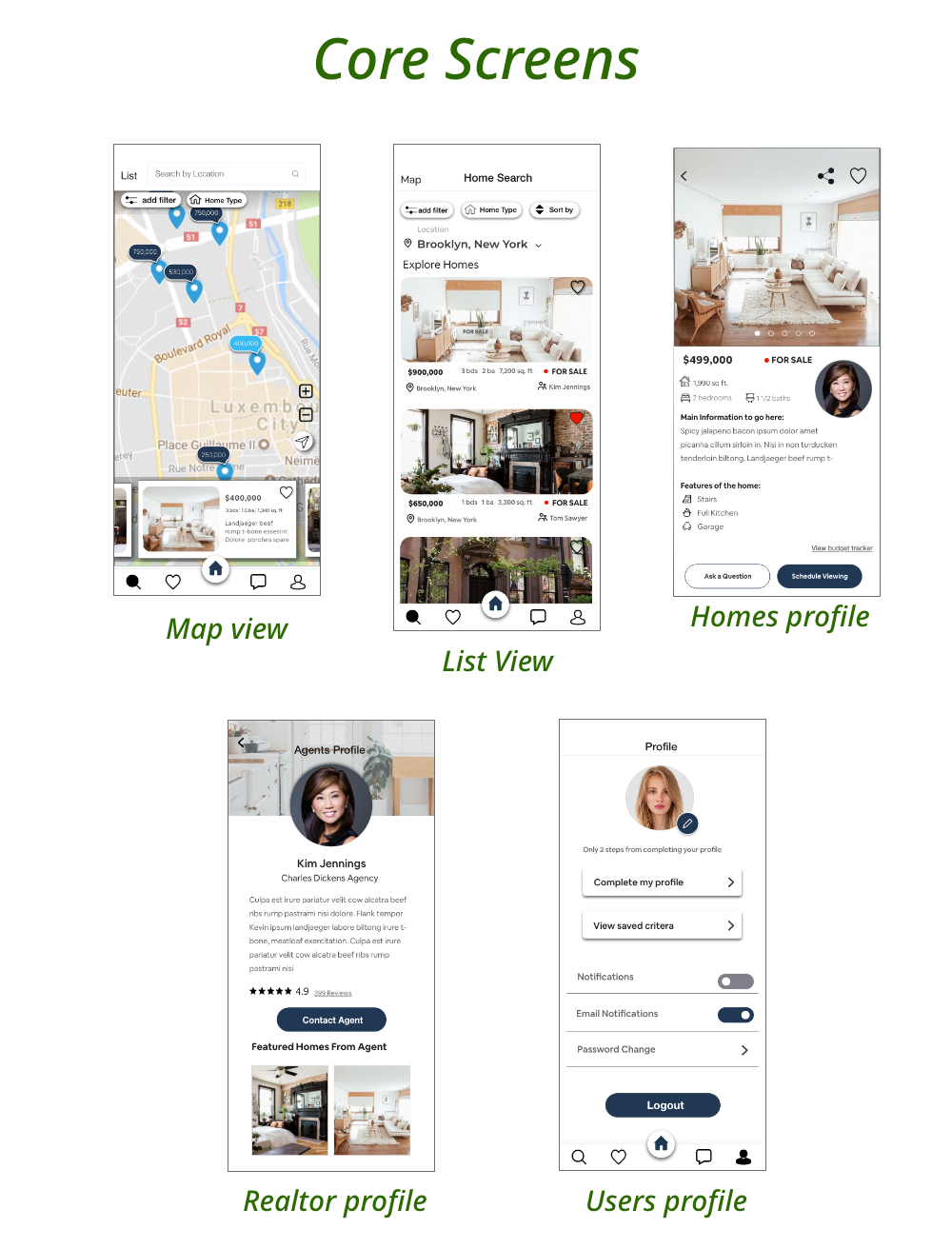
And finally, we get to look at the pretty pictures!
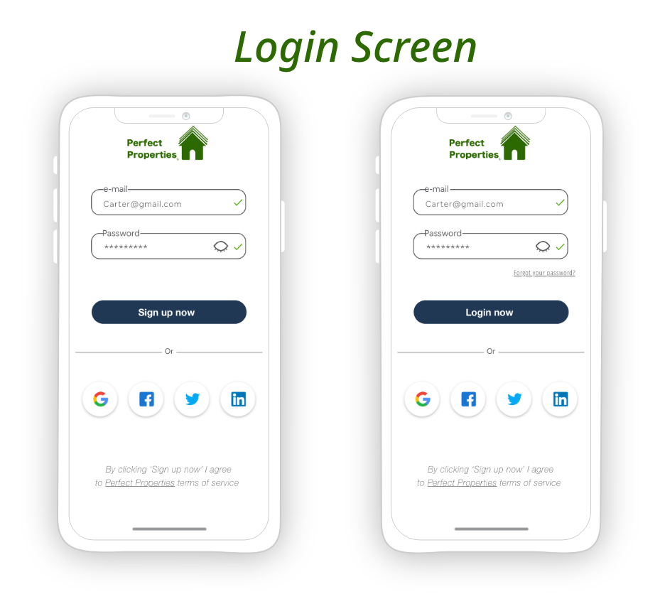
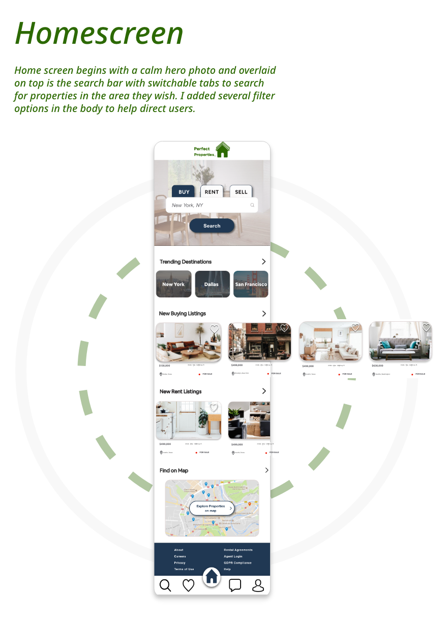
Taking all the inspiration from the main challenge, to make simple yet keep the important information on the forefront.
I also took from the brand allowed the final design to remain minimalist to ensure the pictures of the homes are the
hero of the app while the colors and typography lend to a calming, clean effect.
Without further ado…
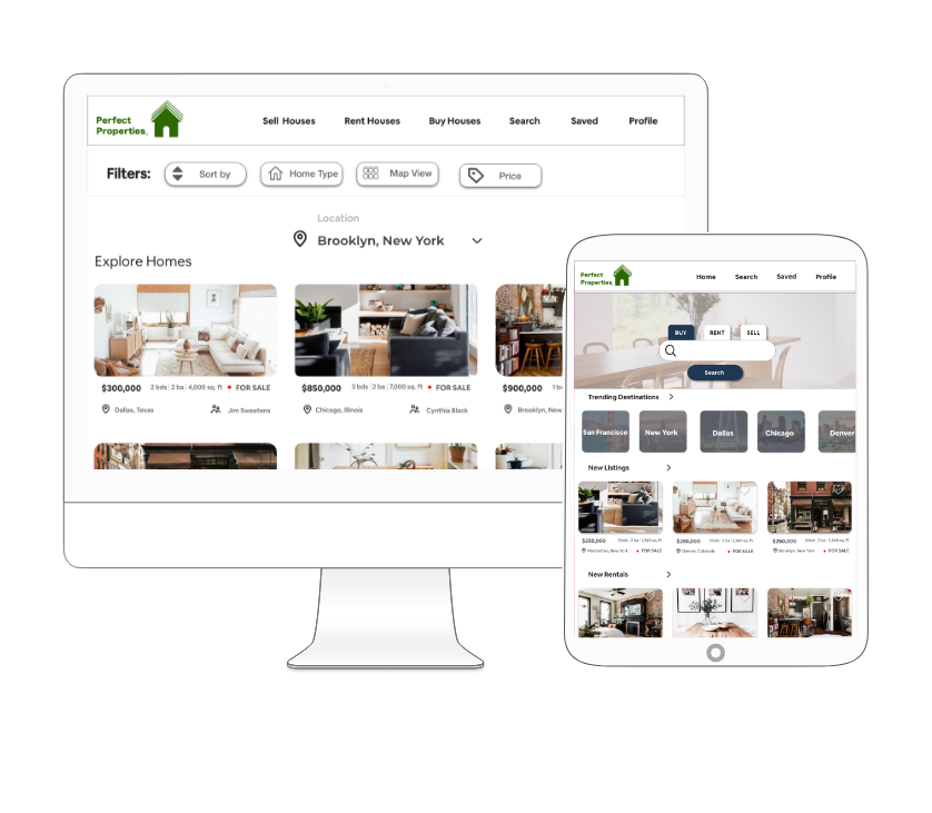
Desktop & iPad View
How the app would look on some bigger screens.
