Nestlé Enhanced Career Journey
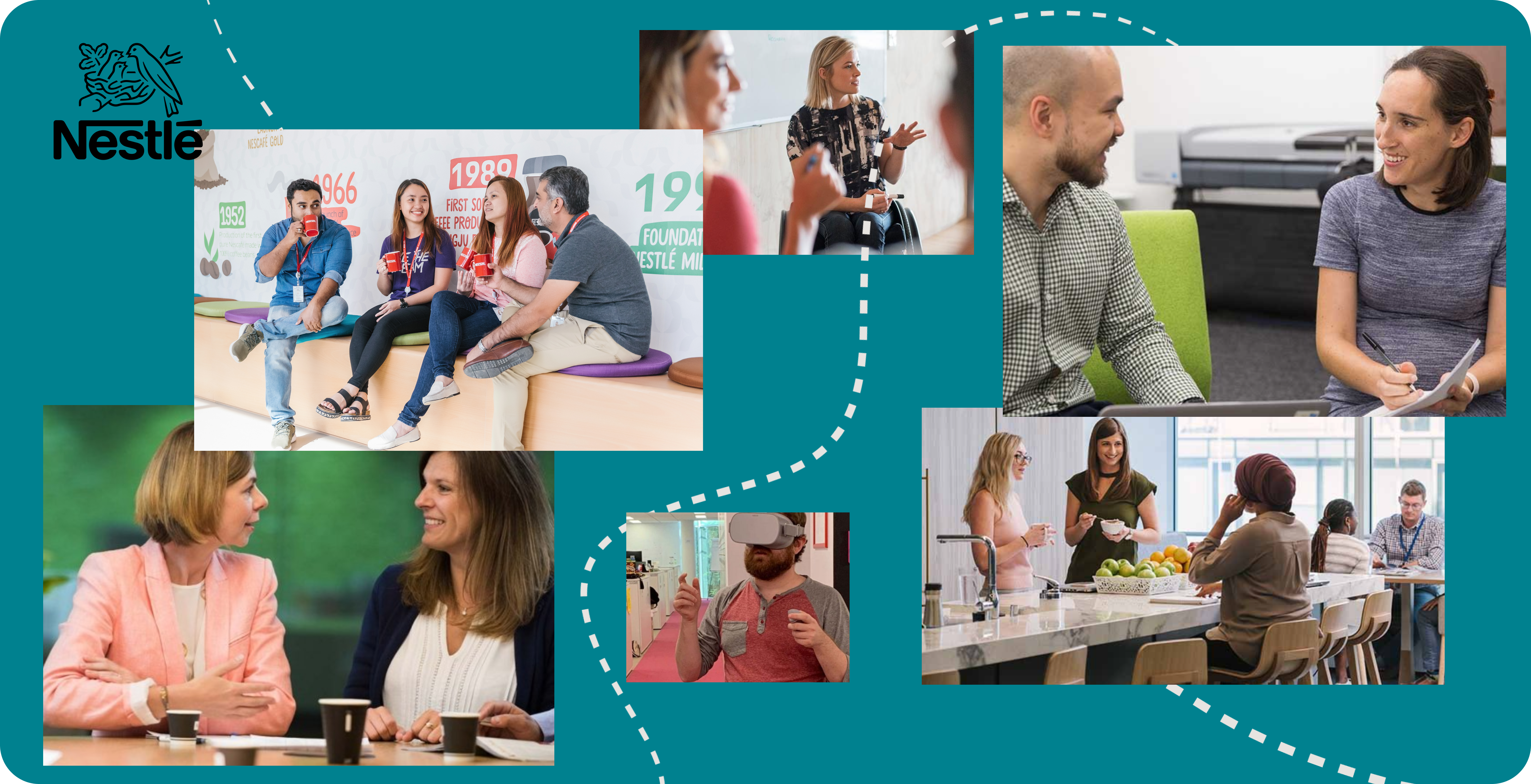
Nestlè is the world’s largest food and beverage company with around 275,000 employees and a presence in 188 countries. Demonstrating why Nestlé is the employer of choice for great talent is all in understanding who to attract and how to speak to them. Unlocking the power of food to enhance the quality of life for everyone, today and for generations to come starts with finding the right people.
THE BRIEF
Nestlé's current stand by one main principle: Be a force for good. But how does the biggest FMCG company communicate that to potential talent?
Nestle asked to collaborate on enhancing the careers section of the Nestlé global website + 70 local websites and review the overall approach, content, audience journeys and user experience
across their main digital platforms.
This case study will focus on the personalised recruitment process of the Nestlé story as we guide applicants on the different steps of their recruitment journey and provide tips along the way.

DISCOVERY RESEARCH
Audience research
The three different key future talent were identified
-

Experienced:
they are driven by leaving the world a bit better than they found it and get energized by other people’s passion. they are skeptical about whether big corporations can make this world better and if our leaders care.
-

Young graduates:
They are driven by two days that are not the same; every day is a new opportunity to see their ideas brought to life and create something new. They are skeptical about staying stable for too long and feeling too comfortable – they are worried it’ll cause them to lose their energy and urgency.
-

Not your average job seeker:
they are driven by the right career move in a company that shares their values and helps them to grow professionally and personally. they are skeptical about inauthentic companies. they are easily put off, especially when the job application process is over-complicated.
Competitor Analysis
The competition is the traditional multinational peers (E.G. P&G and Unilever) but also now includes start-ups and other industries (healthcare and tech). which candidates perceive to be dynamic places where they can have an immediate impact.
Design for an experience
1. Differentiation from competitors
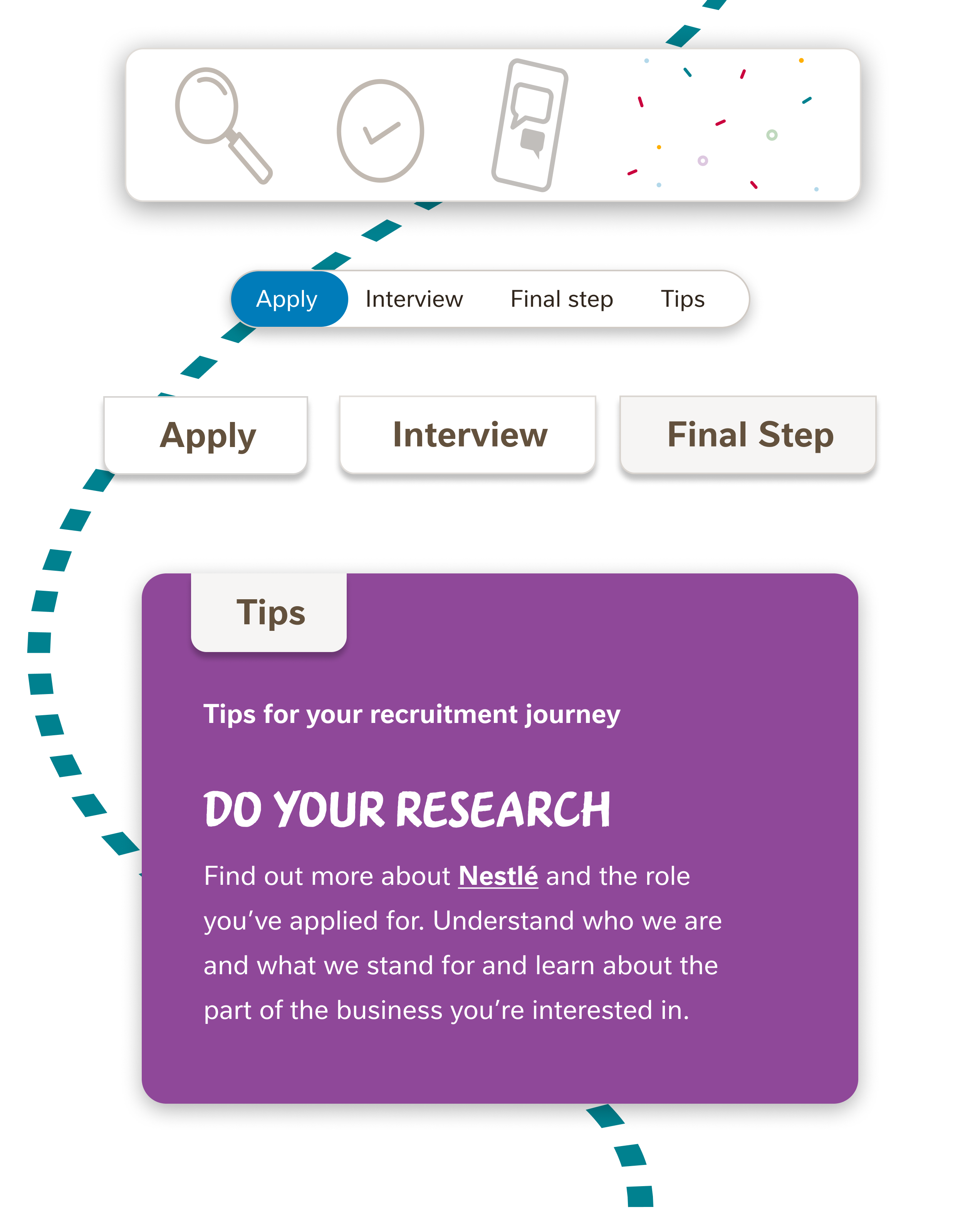
While performing our competitor analysis we found lots of bland, uninspired versions explaining the steps of a recruitment process. Nestlé had an opportunity to not only inform a future applicant but also allow said applicant to feel like they were already part of the Nestlé family.
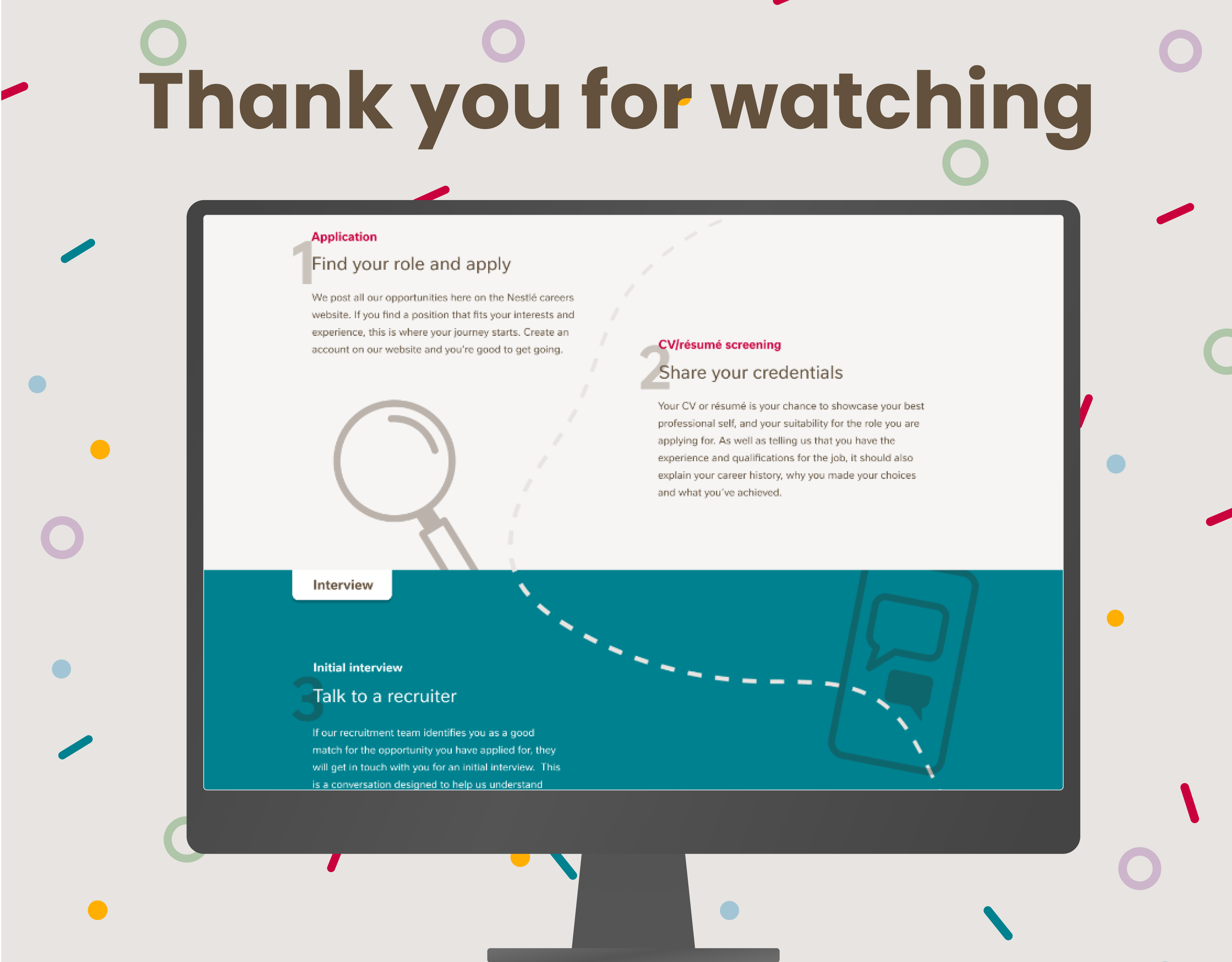
To differentiate the requirement process became one page, with an in-page navigation for simple access to content. Broken up into different stages are three digestible categories that are easy to follow for any background of a potential job seeker. At the end of the page, there is a
'tips' section to ensure this process feels reciprocal, presenting what Nestle expects and ensuring any applicant is the right fit.
2. Matching the audience to the experience
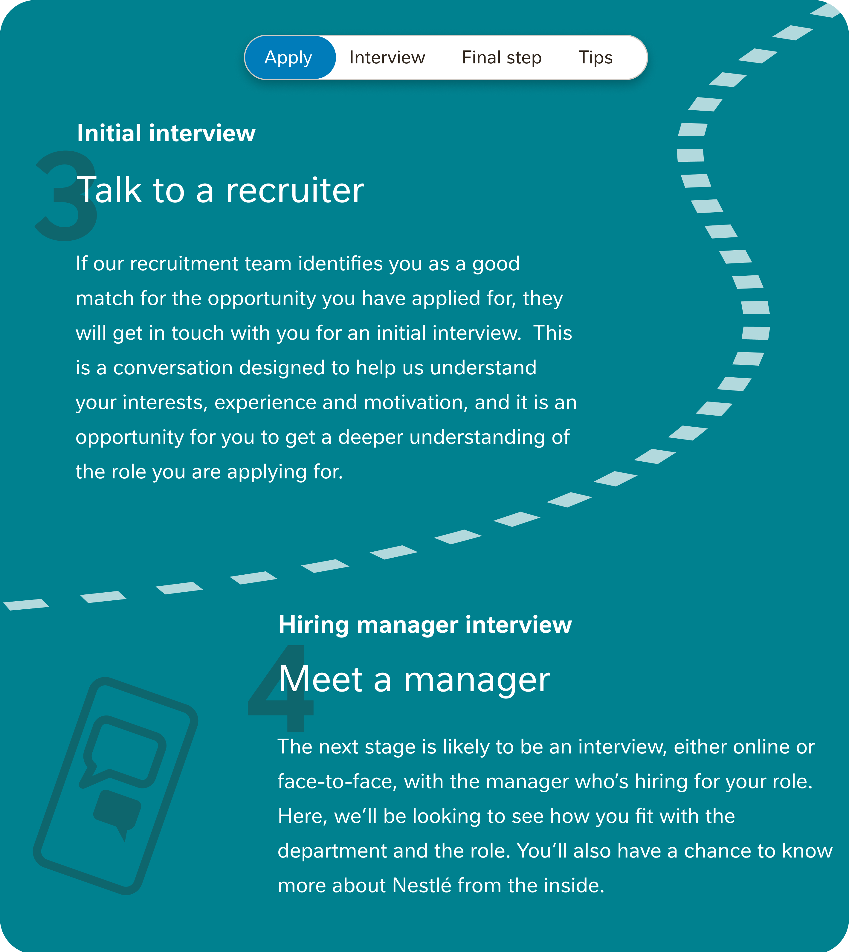
The focus of the audience research led us to define three different audience types in various phases of their careers. We needed to make the journey simple enough that young talent felt empowered to apply but not too simple that experienced job candidates feel they wasted their time on the page.
To balance these requirements we combined several steps of the Nestlé recruitment process that over-complicated the journey.
We added tips at the bottom of the page to avoid 'cluttering' the page from the actual steps of the process and added call-to-action buttons along the journey.
3. Making a journey feel approachable
Simplicity wasn't the only challenge when creating a unique yet authentic requirement process page. Making the page feel approachable aligns with Nestlé's goal to attract
the best talent for good.
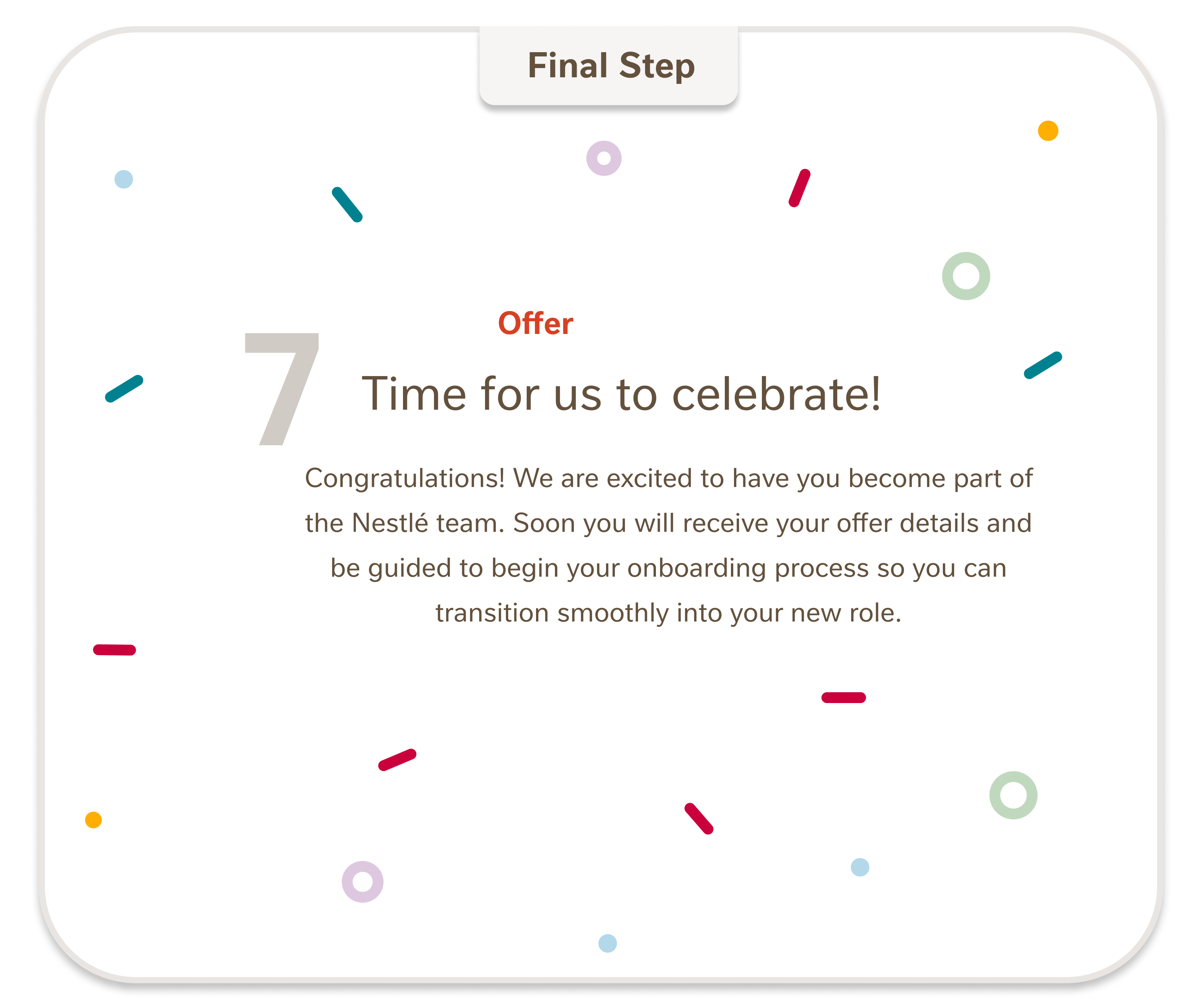
The page had to convey authenticity using fun illustrations that celebrate the process and invite future applicants to track their journey using a scrollable line animation. The goal of the page was always to inform an applicant while making the job seeker comfortable with Nestlé's values and brand.
KPI's & Improvements
Secondary user research was conducted after the launch of the website in the form of user interviews. Highlights from the consolidated feedback stated
- Be a force for good is clearly positioned on the website and well understood by users
- The website is clearer and easier for job seekers to understand.
- The recruitment process was simple and easy to use
Some improvements to added benefits for job seekers needed to be better defined as well as the removal of quick links on the recruitment page due to low click rate.
If you would like to see the page in action take a look at the full website linked below.
*Pages of the website may look differently than outlines. Radley Yeldars team is constantly improving the Nestlé Global website as of an ongoing contact with the Nestlé team. The designs above are from the beginning of the launch.
Any questions on further work performed for the Nestle account feel free to get in touch.
